Part of my job is helping clients understand that my work tells their story. That means time spent on research, discussions, sketches, and revisions. This work on the front end gives a much stronger, more compelling narrative about who they are and who they want to be.
“Graduate to a New Job” Campaign:
Richland College
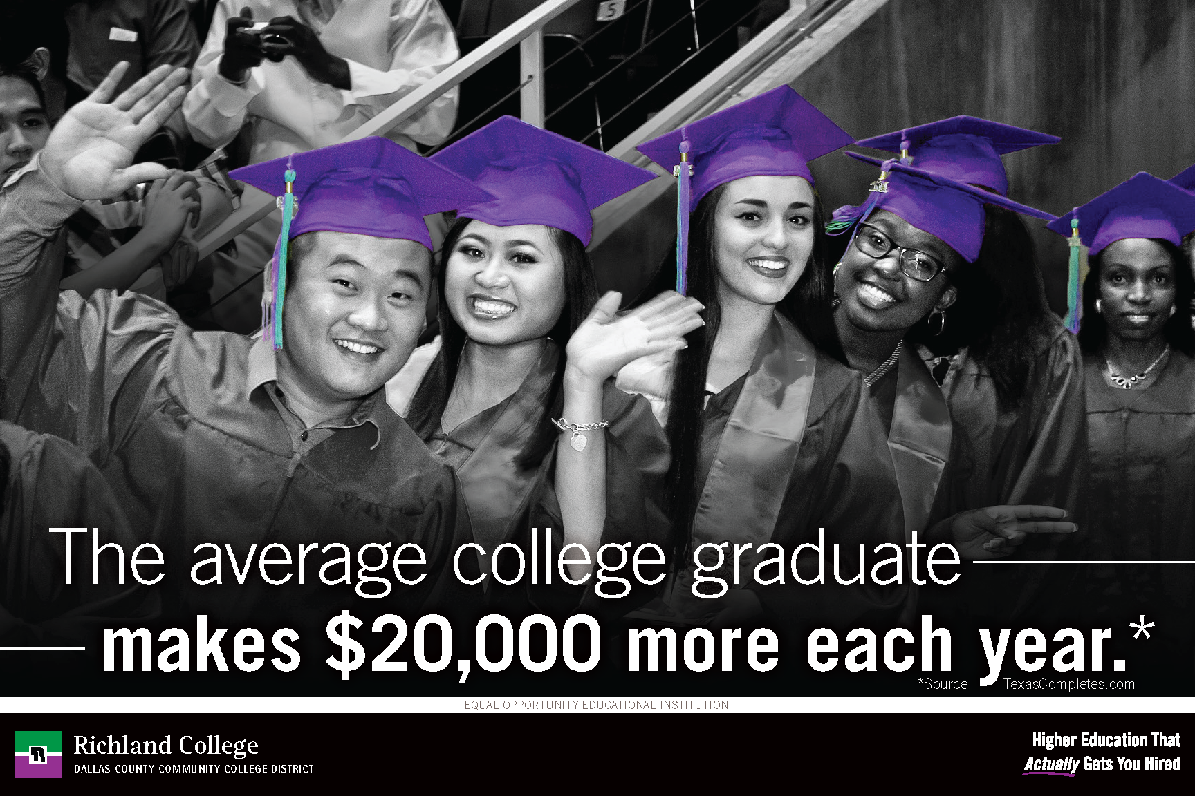
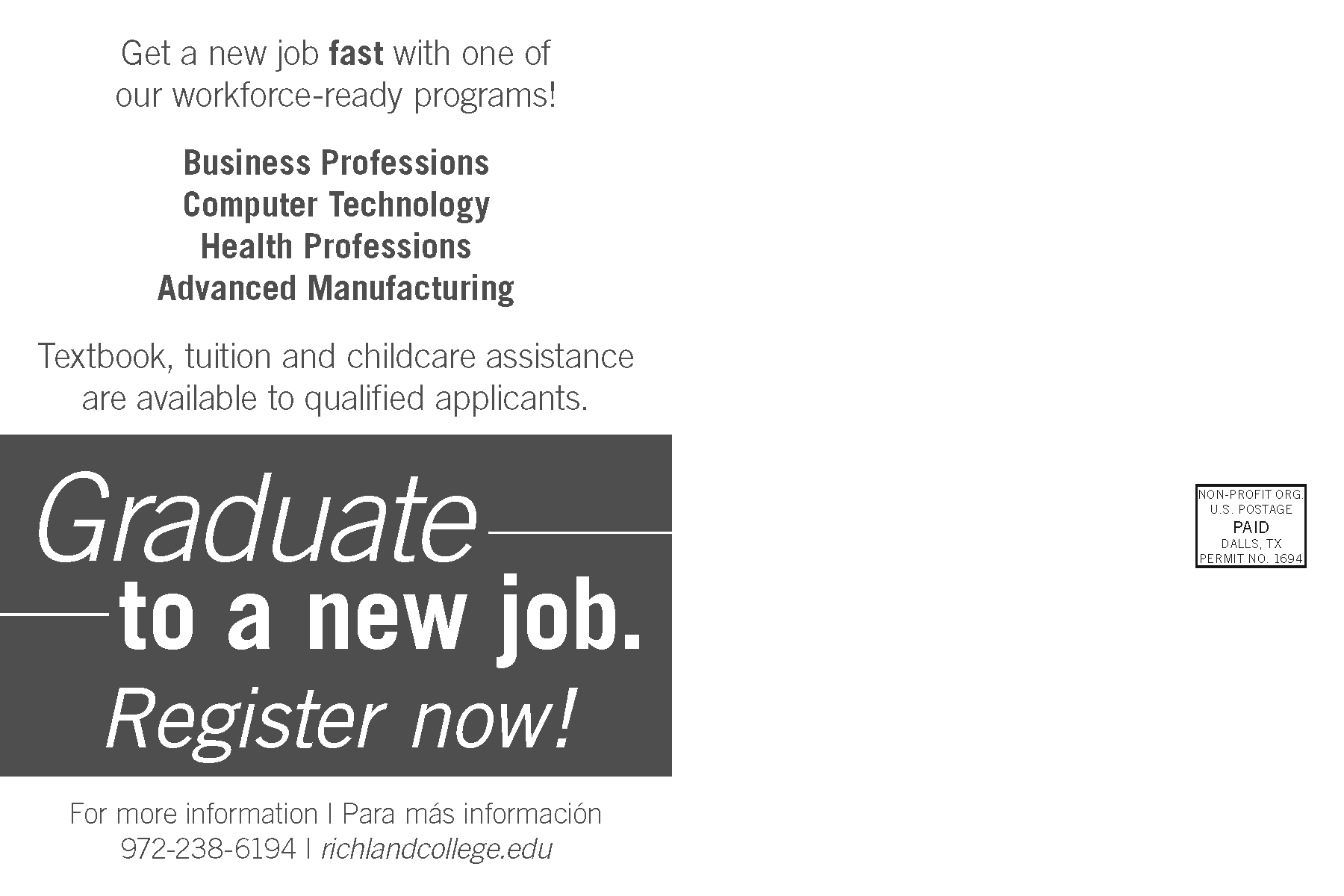
In fall of 2017 I was tasked with creating a full campaign for Richland College, now Dallas College Richland Campus. Working within the Marketing department and directly with the college president, I helped create the tagline and built out the imagery.
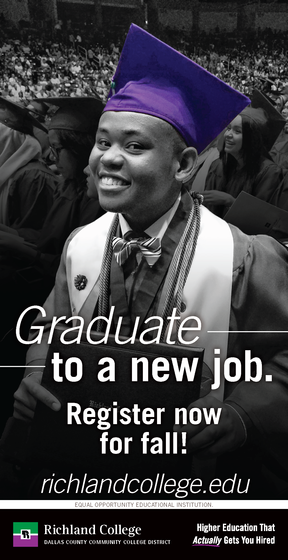
This photo of a student named Phelan uses Richland’s official shade of purple to focus on the iconic graduation cap, and, by extension, Phelan’s achievement.
It was soon expanded to include other students to reflect their diverse population and included print ads, digital signage, web banners, mailers, and billboards across Dallas county.

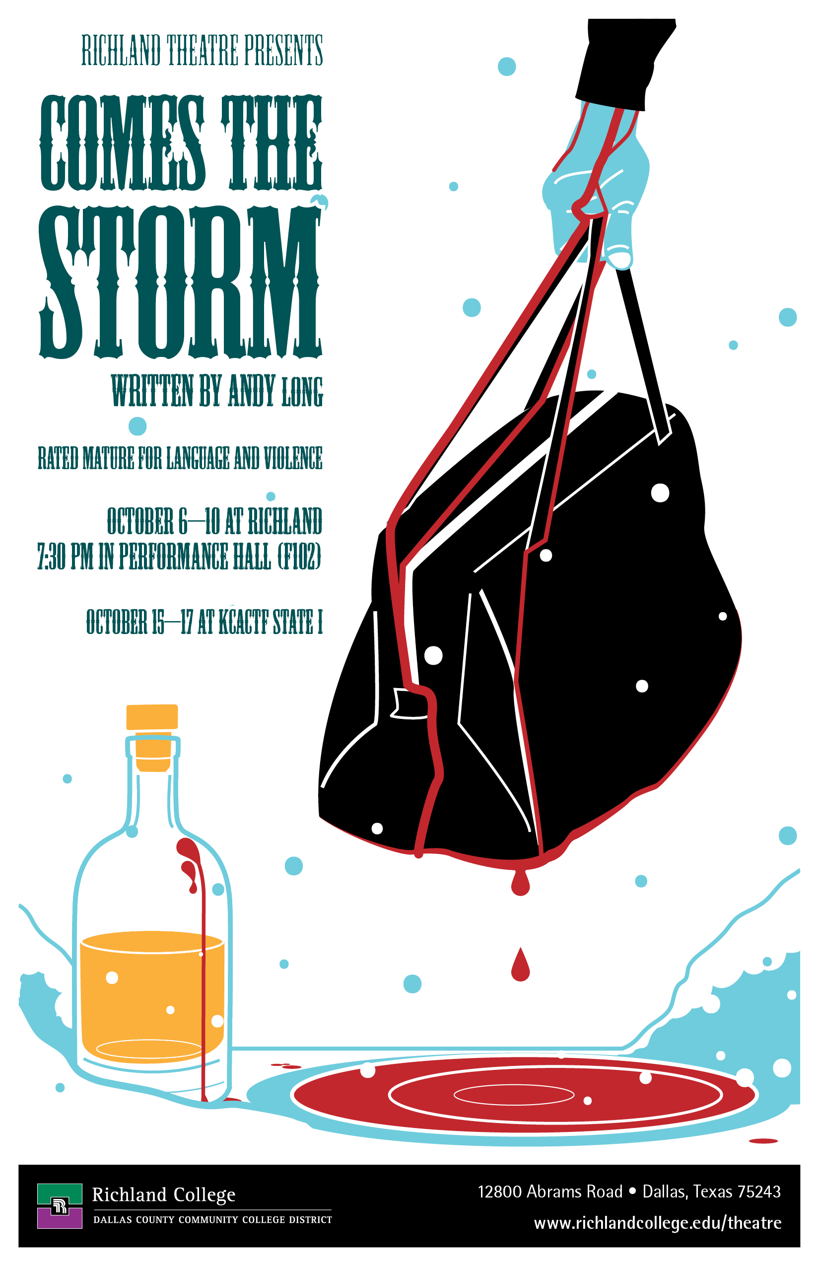
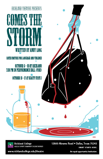
“Comes the Storm”: Richland College Theatre
The Richland Theatre Department has consistently been one of my favorite clients. I always ask for a copy of their script so I can get a good feel for it and tailor my work specifically to each production.
In 2016, they performed an original play titled “Comes the Storm,” based on the book of Job in the Old Testament. To promote this run, I created posters, playbill programs, fliers, digital displays, and email images using my illustration skills.
The amount of fun I had working on it shows and made me a Gold award winner at the 2016 Educational Advertising Awards.
Wildflower! Arts and Music Festival
Promotional Materials: Richland College

For Richland’s booth at the 2018 Wildflower! Arts and Music Festival in Richardson, Texas I created designs and sourced vendors for promotional materials. These included glow-in-the-dark shirts, photo backdrops, temporary tattoos, and props for selfies.
We received more volunteer applications than any previous year when my new shirt design was debuted. That’s why you should always let your designers have more money for promo swag than you think.
Mascot Rebranding Case Study:
Richland College

This is a big one for me and one of my longest-running projects, so excuse me as I wax eloquent on this one.
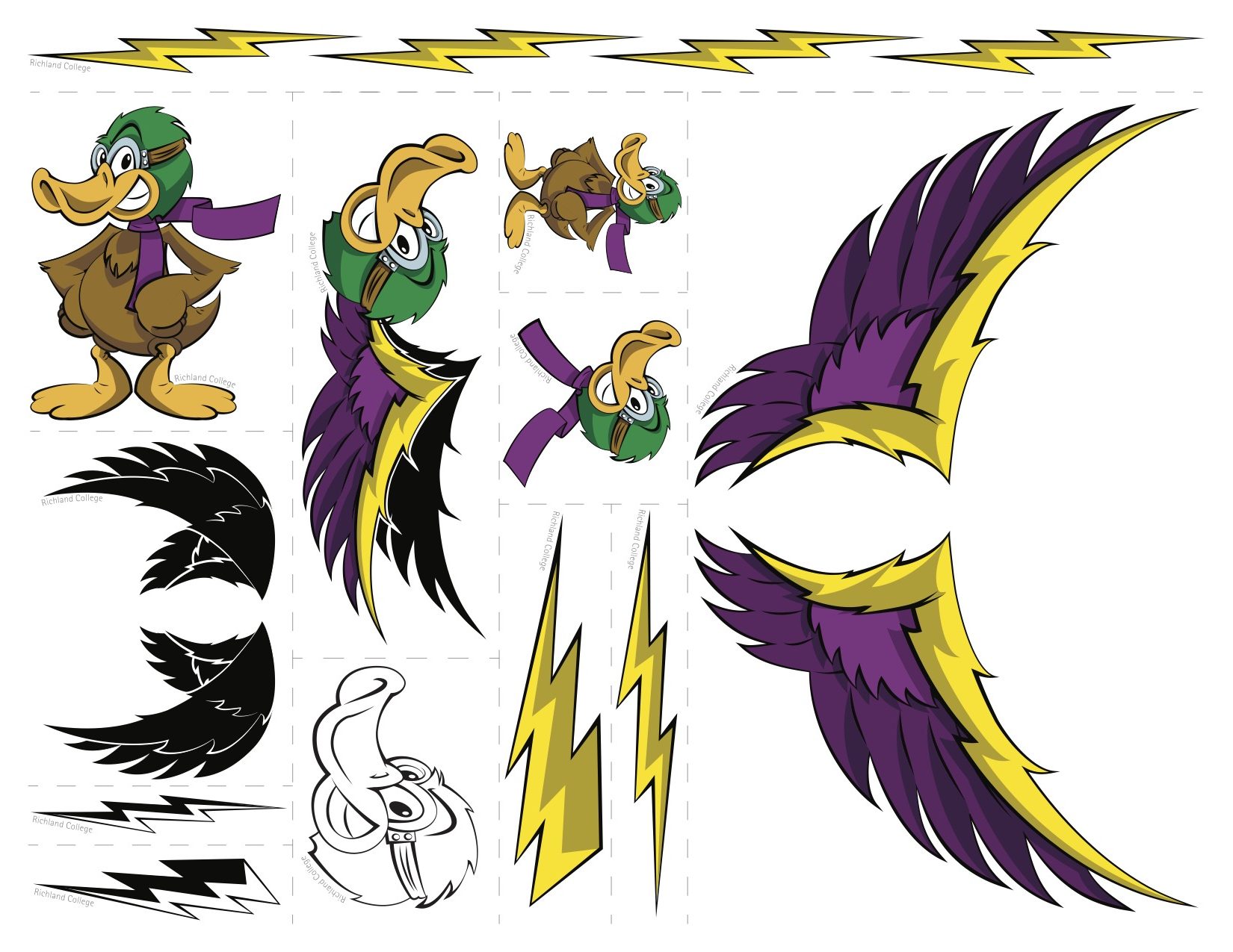
Meet R. Möbius Thunderduck, the Richland College (now Richland Campus Dallas College) mascot. He was initially created by the late Bill Neal, wrestling coach at Richland.
Over the years, multiple versions of Möbius had been created, including an athletics image, various holiday-attired ducks, and a duckling for an early-childcare program.


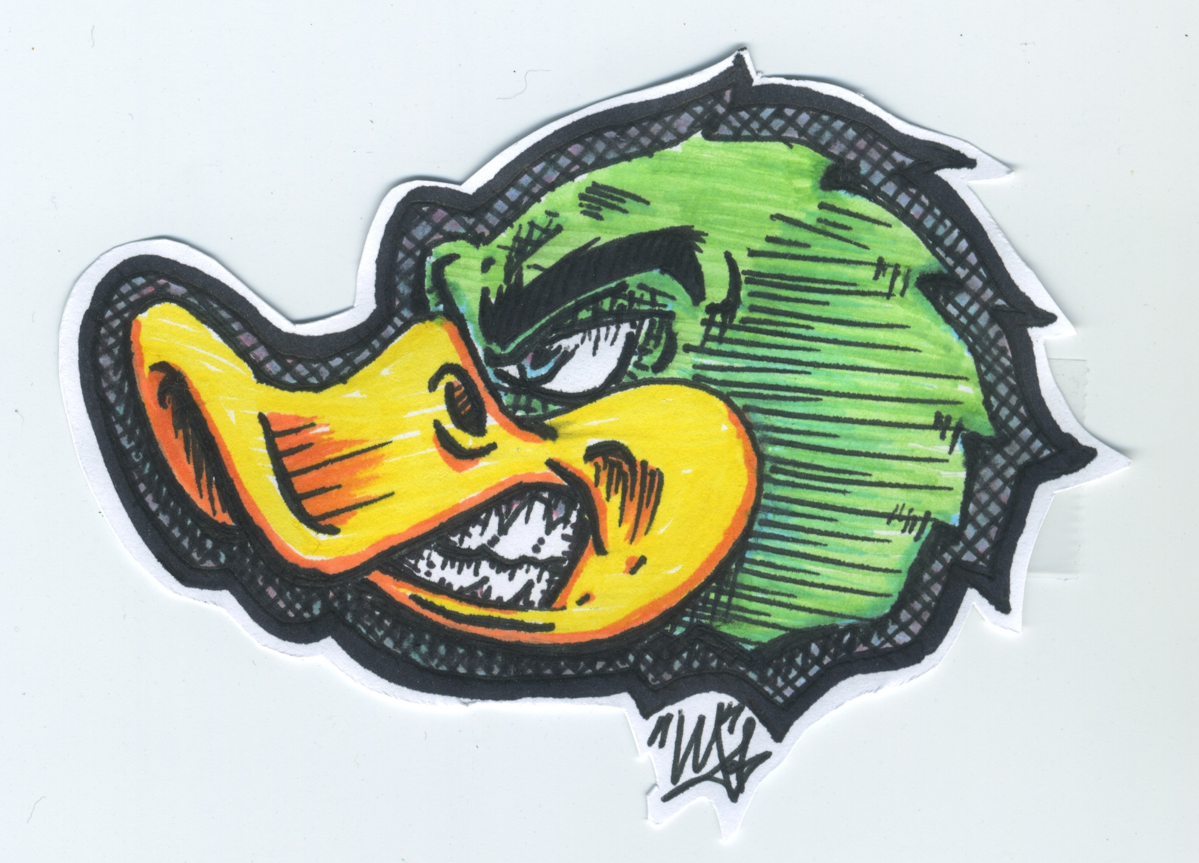
I love cartoons and illustrated media as a whole. There’s a long tradition of fan art in those worlds, so I had to create my own take on Möbius, sketched two days after I started as a Coordinator of Graphic Services in the Richland College Marketing department.
My bosses thought it was fun, but we didn’t think much of using it. We already had an official mascot image, approved by every level of leadership that had been used for years. But I kept doodling.

That continued doodling is what led to this Dallas Observer ad in late 2015, my first advertising illustration that made it to print, discounting an ambulance drawing I made in fourth grade.
This duck illustration gained traction and was featured on Facebook banners, website ads, and Clear Channel electronic billboards.
I knew I’d hit on something. I kept drawing more ducks and talking to colleagues and faculty about using my designs. They loved them and asked for more.
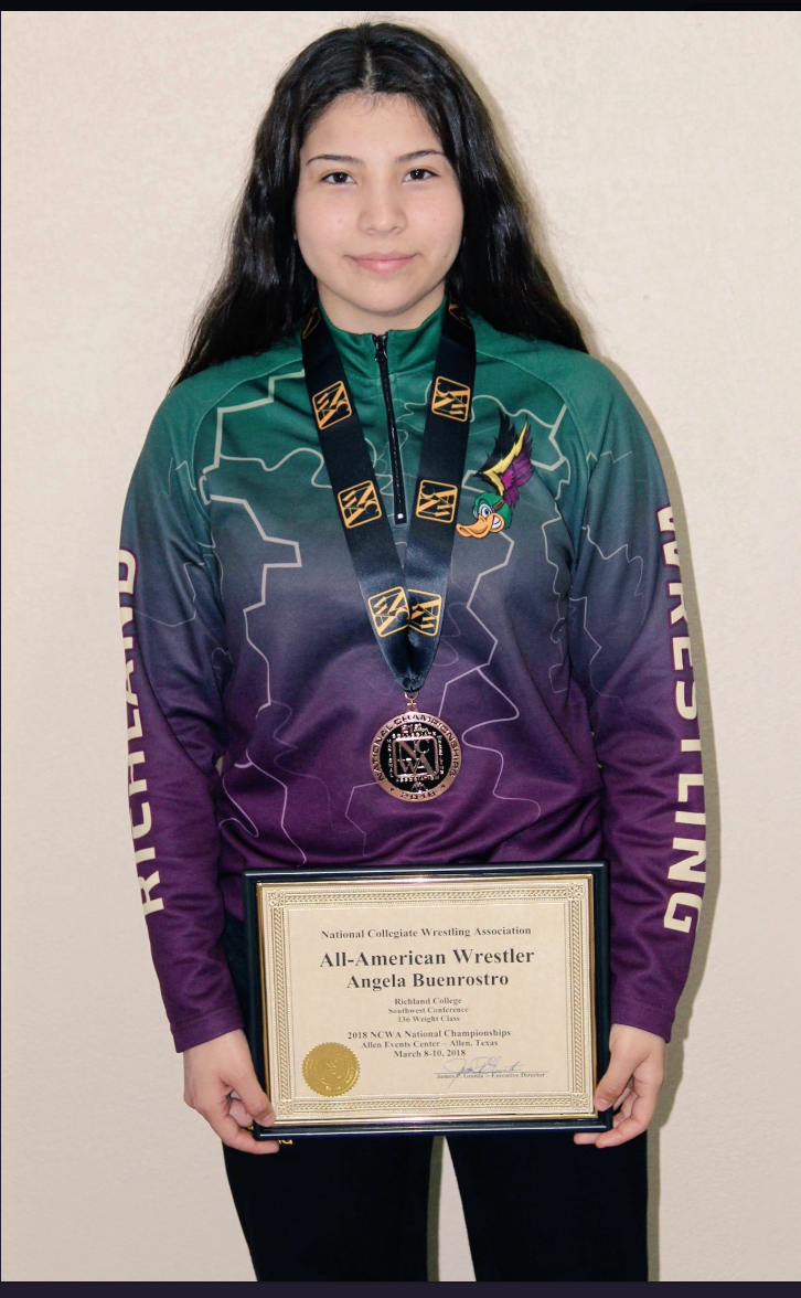
Bill Neal started using the winged duck on his wrestling uniforms. I made photo props and glow-in-the-dark shirts for the Richardson Wildflower Festival, as you saw up above in an earlier case study.
Side note: I love glow-in-the-dark shirts. If the budget has money, my shirts will likely glow.
Suddenly my ducks were everywhere. Giveaway swag. North Texas Food Bank posters featuring a duck designed after my farmer grandpa. Even more shirts. I’ve even seen it placed on a model airplane as a tribute to a former student.

The digital display below showcases much of the flock I created, including a duck that looks suspiciously like my mom when she was teaching. The hero image should be fairly obvious, here. Who knew a college needs a duck playing a sousaphone as advertising? This former tuba player sure did.

As more requests for variations on my version of Möbius rolled in, older versions became far and few between. In 2018, three years after I began this journey, it was time to finally present my rebrand of the athletic mascot, the last consistently used old design, to campus leadership.

This wasn’t my first time to present to the executive team, as I had similar experience pitching a female version of Möbius for the “Duck Wellness Games” held on campus.
She is pictured here on a flyer for the food pantry I helped manage while working with the Office of Student Life for Richland.
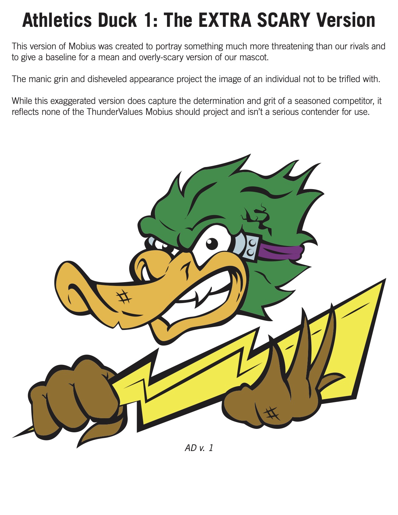
I presented them with evidence that mascots were increasingly aggressive for athletics and that the cute baby duckling often used was especially alienating to much of our student body who wanted to be seen as adults.
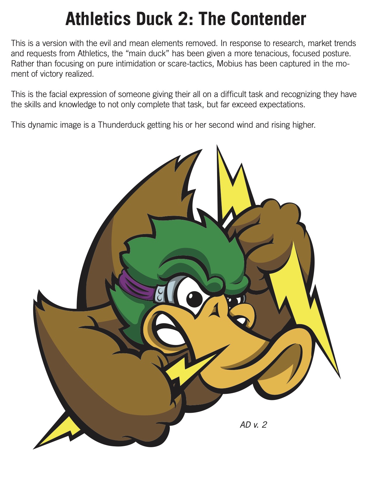
To help allay their fears of creating a mascot that was “too scary,” I created an iteration that could legitimately be seen as such. That made my preferred version, and the one that the athletics department was hoping for, much easier to sell. It was approved and we put it on everything we could.


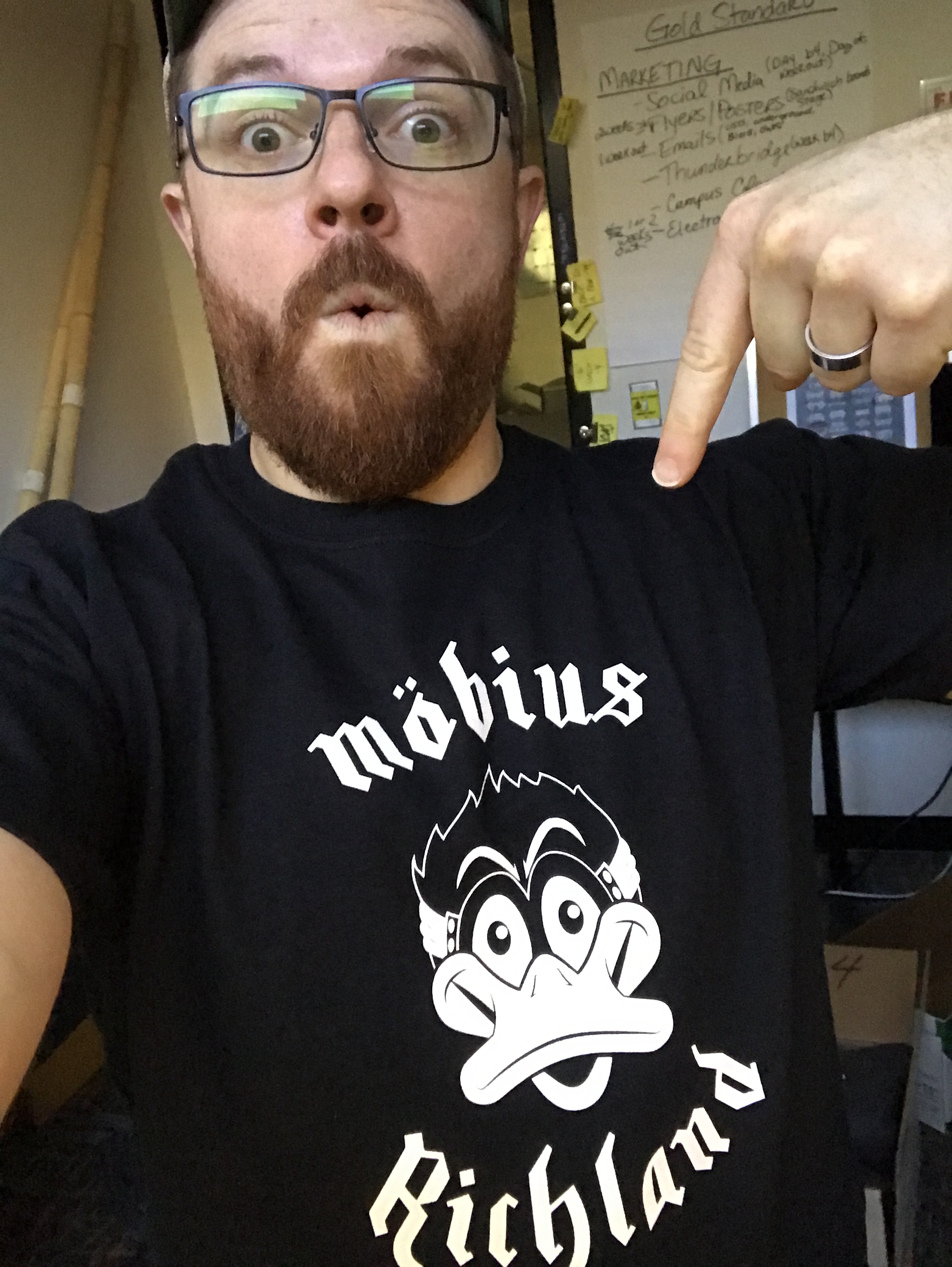
It took over three years of work on my part, but I did it. I got to update the mascot and started working towards copyrighting and trademarking it.
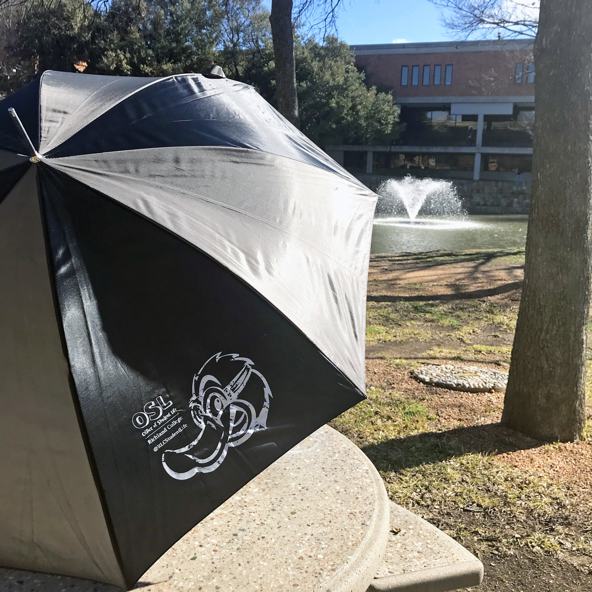
Then the pandemic of 2020 stalled those efforts. This is the last shirts I made for Richland’s Office of Student Life, right before lockdown began, and the last to feature the Thunderduck.
Campus-level mascot branding was taken over by Dallas College district-level marketing and mascots given solely to athletics. A few years later all college mascots were redesigned by an agency.
While admittedly bittersweet that it ended, I don’t regret doing it. I had a great time, made some great artwork, and made a lot of Richland folks happy.
Very happy, it seems.
Despite the restrictions on campus mascot use, students are allowed to create their own artwork and designs for clubs and other student organizations, such as the cover of the Richland Chronicle college newspaper.
Guess whose duck design they’re still drawing?

